Join us.
Read our great ideas.
© BoldCrest. All Rights Reserved
Infratech isn’t just another name in construction consulting. Since the 2000s, this family-run business has been making waves. What’s special? It’s all in the family. Women lead the way here, with leadership passed from mother to daughter. It’s a blend of old-school values with new-age expertise.
With over 15 years of success, Infratech faced a big question: How can their brand truly show who they are? They’ve got history. They’ve got expertise. And they’ve got a unique leadership story. They needed a brand that wrapped all this up, making it clear to everyone who met them.
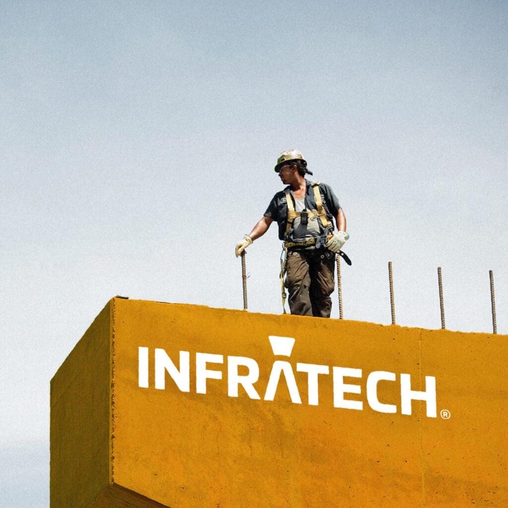
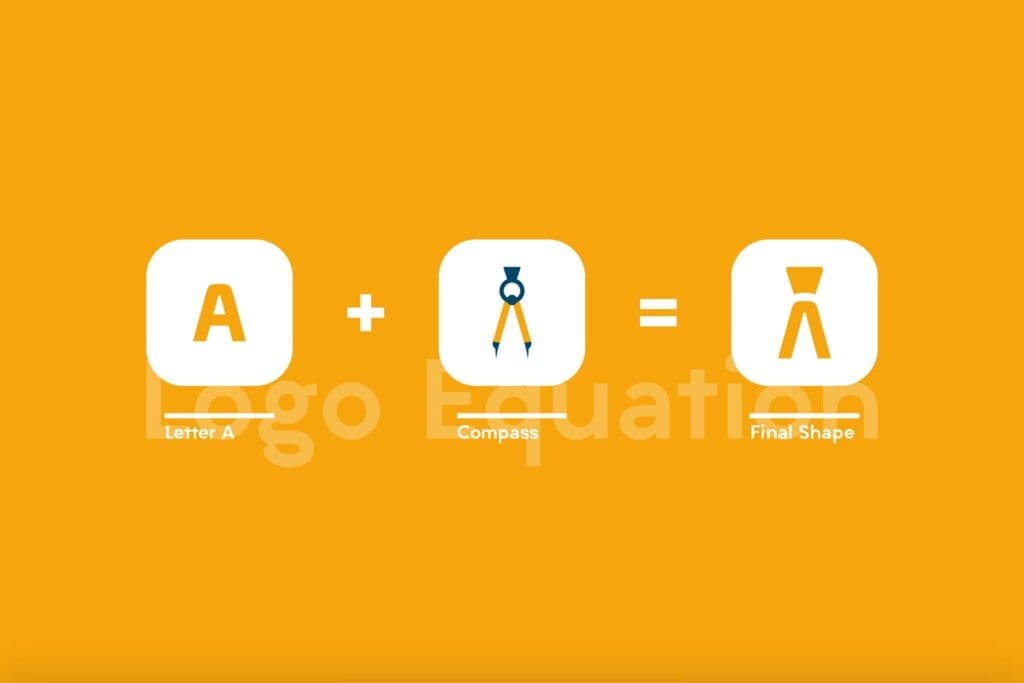
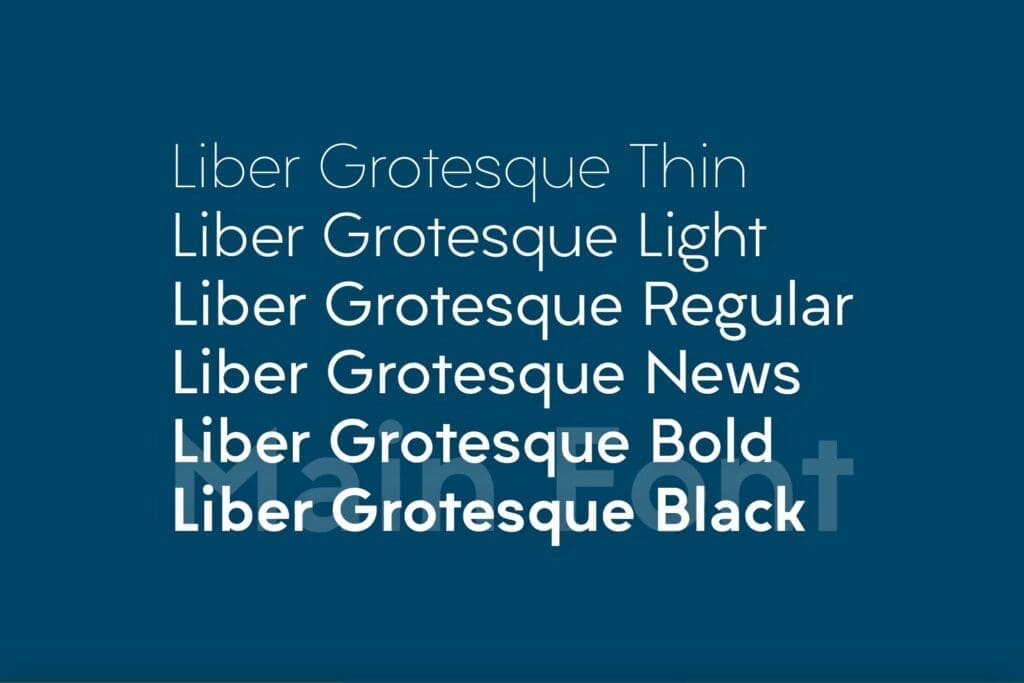
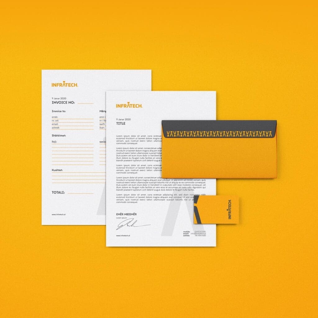
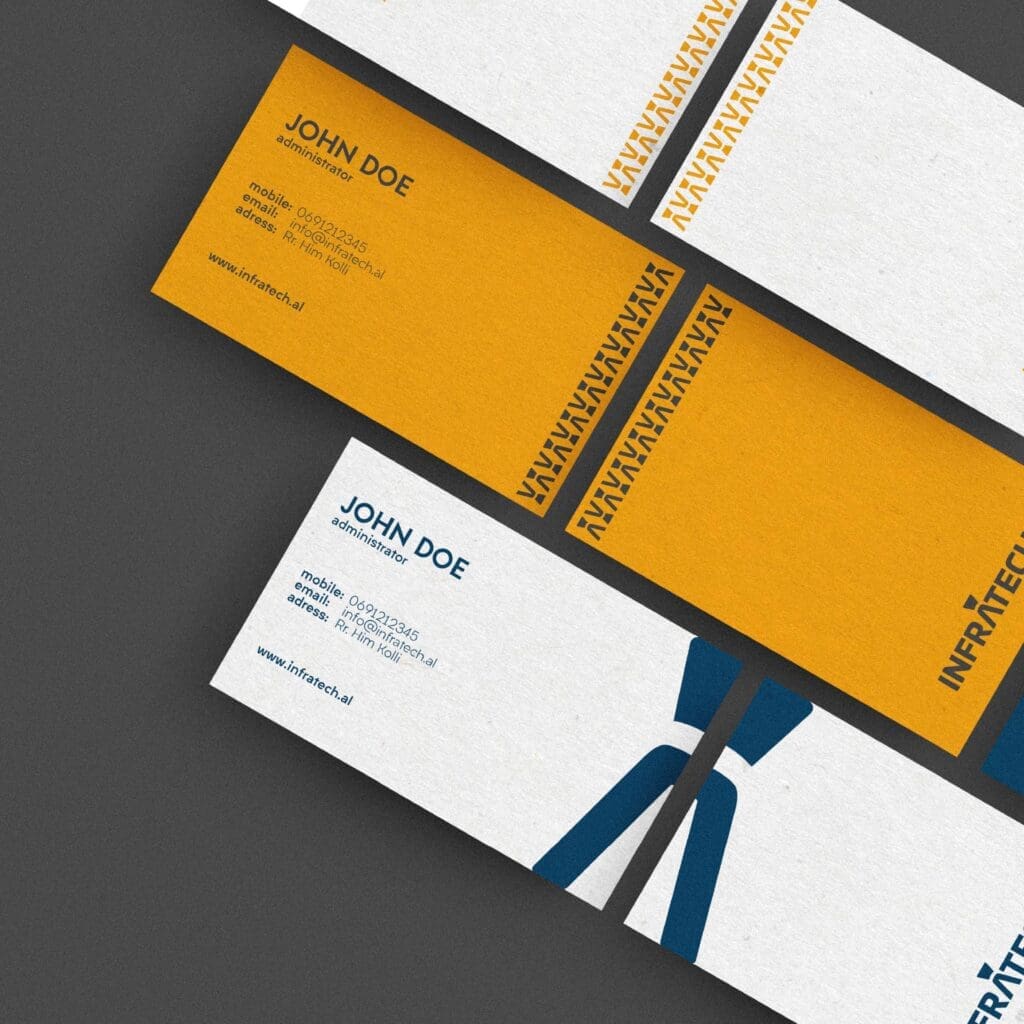
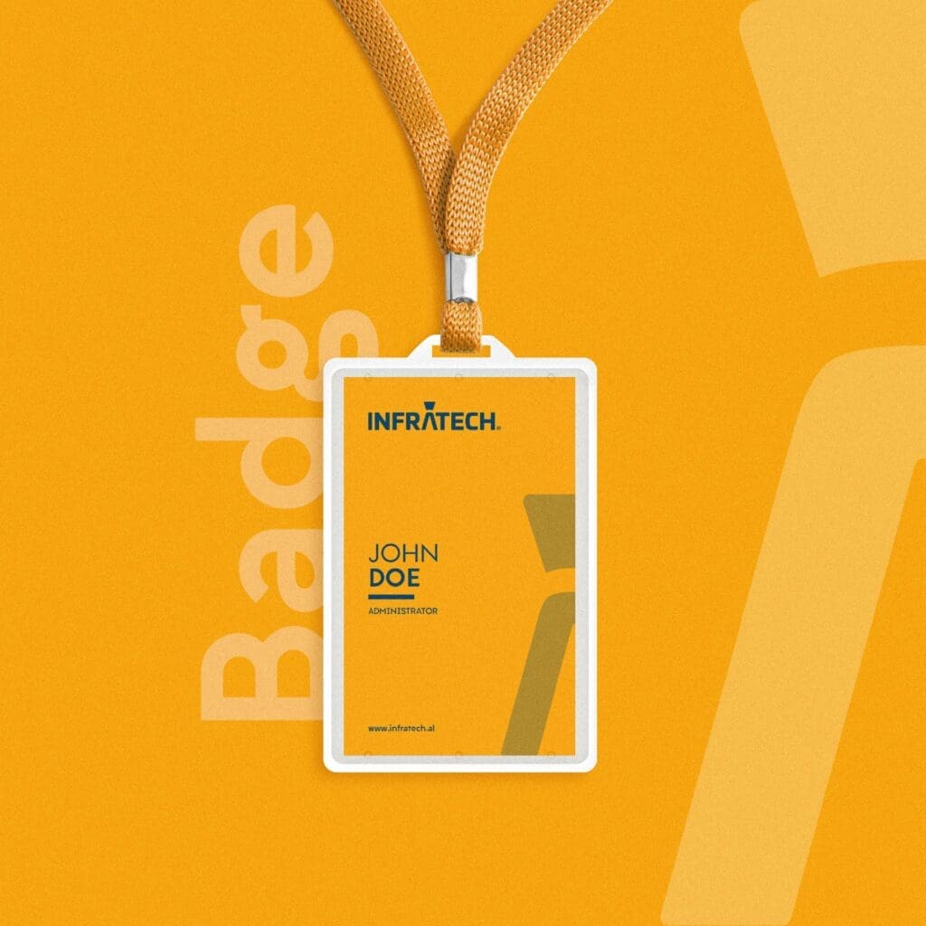
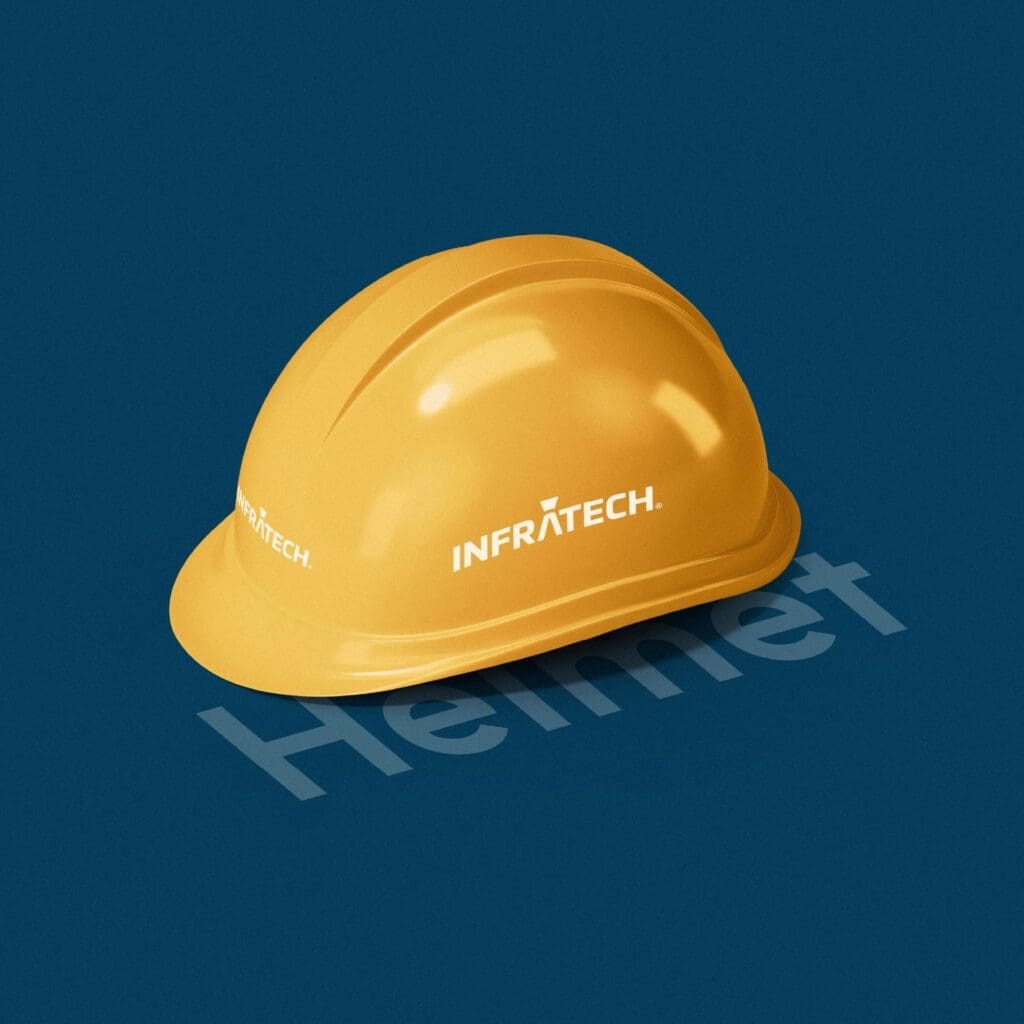
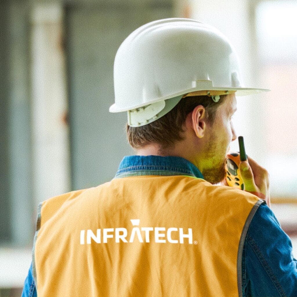
We rolled up our sleeves and dived into Infratech’s world. The result? A brand that speaks volumes. The logo now has a compass, a nod to their eye for detail. We chose the Liber Grotesque font because it’s clear and modern. And the colors? Bright yellow for energy, with touches of calming blue and gray. It’s not just a brand; it’s Infratech’s story told right.


© BoldCrest. All Rights Reserved