Join us.
Read our great ideas.
© BoldCrest. All Rights Reserved
Karrige Pogradeci, since its inception in 2000, has carved a niche for itself as a leading producer of chairs and related products. With a diverse range of chair models and a commitment to comfort, they have expanded their reach, exporting 30% of their production units internationally.
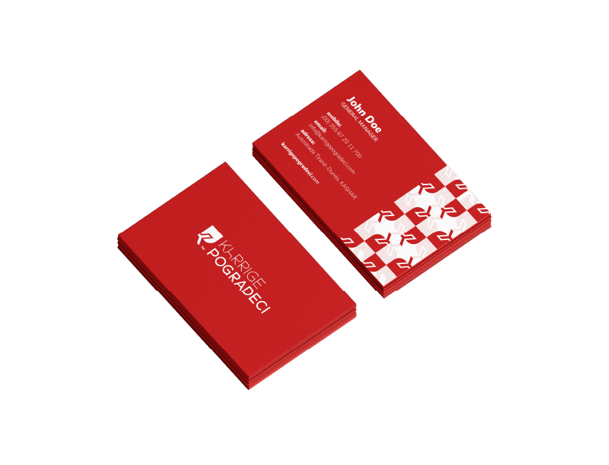
Despite their strong market presence, Karrige Pogradeci felt the need to rejuvenate their brand image. Their primary goal was to craft a visual identity that not only resonated with their legacy but also remained etched in the minds of their audience for years to come.
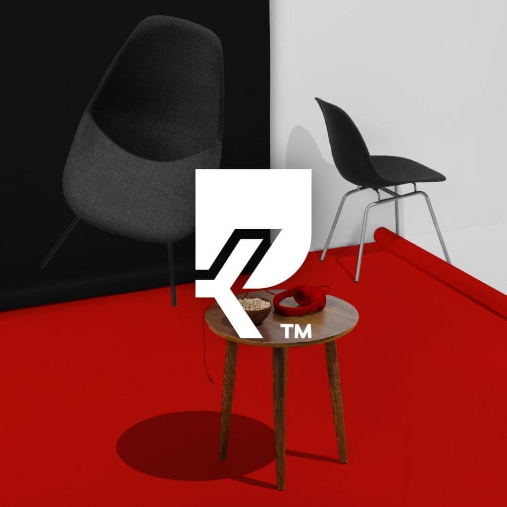
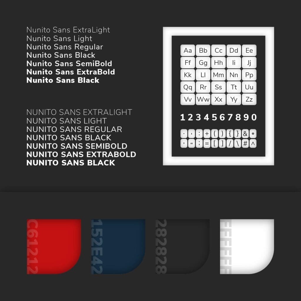
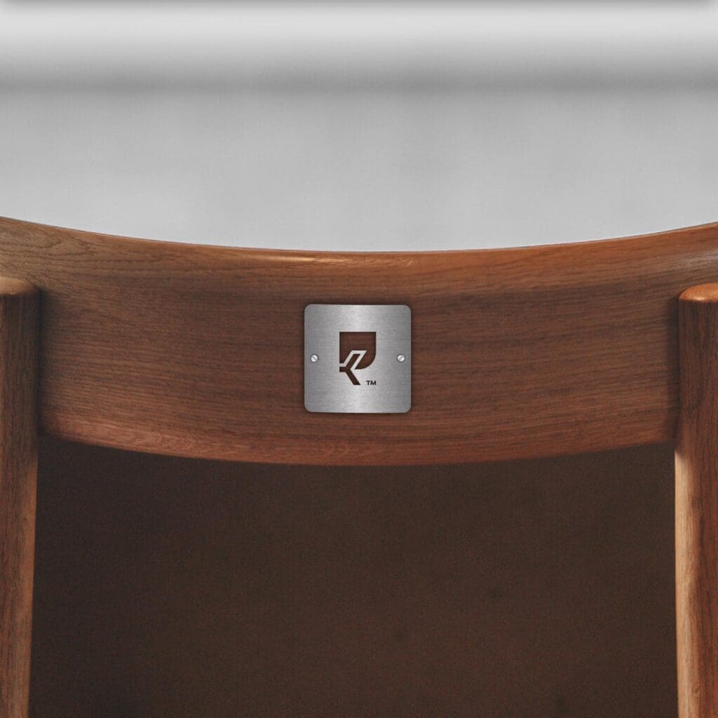
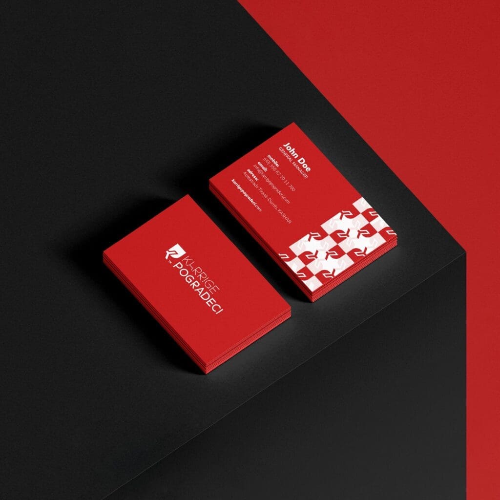
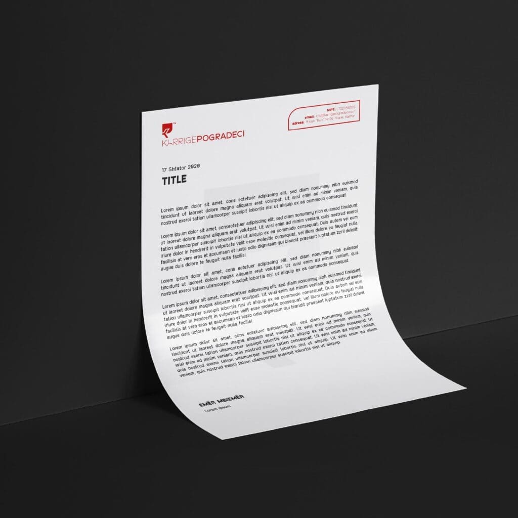
BoldCrest rose to the challenge, conceptualizing a logo that ingeniously integrates the shape of an armchair to form the letters ‘K’ and ‘P’, representing ‘Karrige Pogradeci’. This design element is so versatile that it can seamlessly replace the letter ‘A’ in the brand name. The choice of red as the primary color signifies the brand’s passion for life and comfort. This refreshed visual identity has been consistently applied across all communication channels, ensuring a cohesive brand experience for their clientele.


© BoldCrest. All Rights Reserved